
Git Pages:
Various projects and work looking at data science in the context of insight. I like to focus on: tools and techniques, data visualisation and the data to value pipeline
Personal Links:
View My LinkedIn Profile
View My GitHub Profile
View My Webpages at: https://adam.etches.uk
Space-Time Data Cube
In this example I wanted to experiment with whether a space-time cube visualization would add any additional visual analytical qualities above a 2 dimensional (or 2.5 :smirk: ).
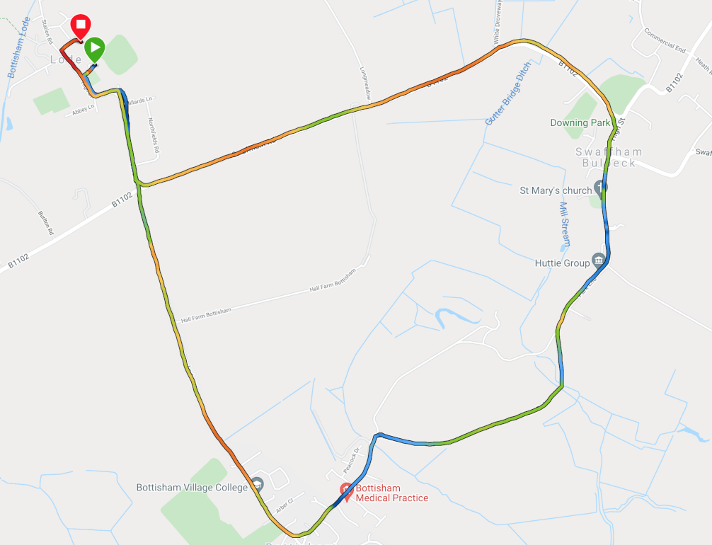
For this illustration I selected one of my morning runs where I usually like to analyse my running pace (or rather lack of it). I always run with a GPS sports watch, my current being the Garmin Vivosport which is connected to my Garmin Connect account (more on this later).
From Garmin Connect it’s straightforward enough to download data for a specific run in a GPX file so this was my space-time source in the form of latitude, longitude and timestamp.
I also wanted to give any visualization some geographical context so I also acquired an Ordnance Survey basemap for the region covered by my route.
Then turning to Jupyter Lab, matlab and plotly I set about building the following interactive visualization
In this visualisation time is represented on the z axis which is normalised to the start of the run at 0 seconds. When this is overlaid with the spatial dimensions x and y represented as lat and long, any change in pace is visualised by the changing of the gradient of the red line which is the path of the run.
Rotating the interactive data cube to a plan view where the z axis is perpendicular to the x,y axes emphasizes any change in gradient.
Conclusions
Although an interesting exercise and a pretty visualisation I honestly don’t think the extra dimension add anything to the analysis. Compare the 3d to the 2d using a colour to present pace (this is a standard widget on the Garmin Connect App). Personally I much pefer the 2d view
All opinions expressed are my own and based on my experiences with my own equipment.